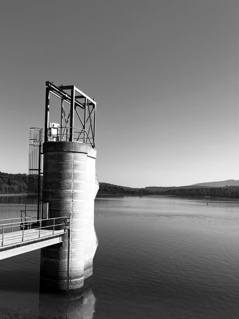
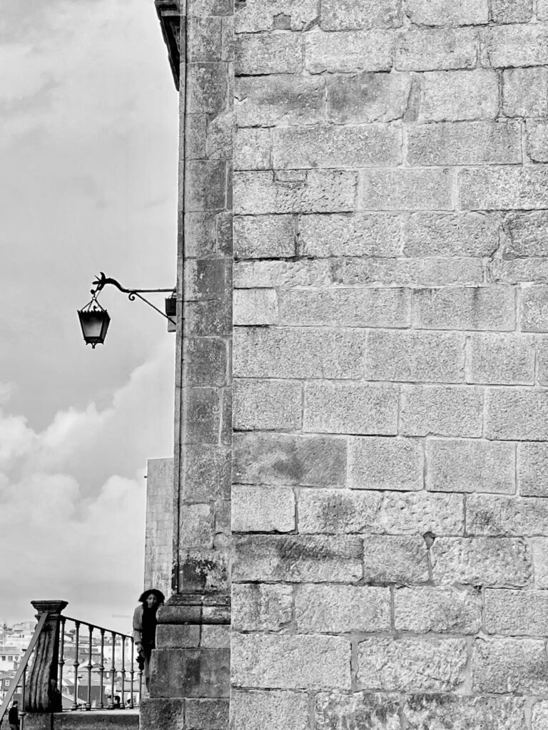
Black and white is where minimalism feels most at home. Stripped of colour, there is no distraction. A single subject can speak louder than a crowded scene, inviting the eye to see less—which sometimes is all that matters.

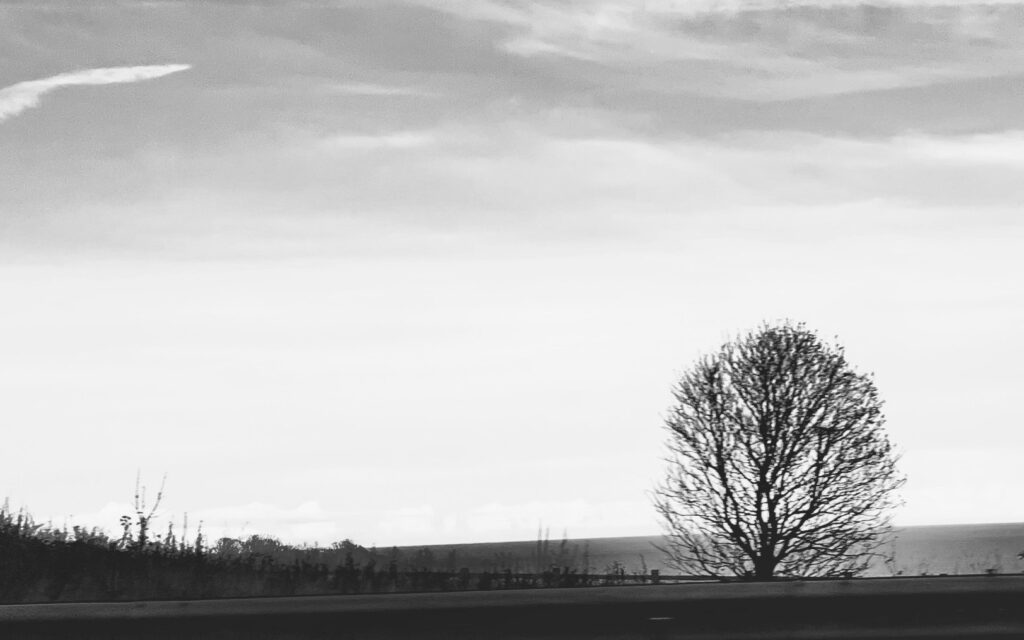
(As suggested by my fellow bloggers, Ritva and Sarah, this image may work better using the rule of thirds—so here it is.)
I am linking this to Ritva’s Lens Artist Photo Challenge
Love the silhouette!
Thanks Dawn.
Very nice Teresa, you chose well
Thanks Ali.
Superb, Teresa. That silhouette of the bull could be used for advertising Spain.
It can, hopefully I will get paid haha
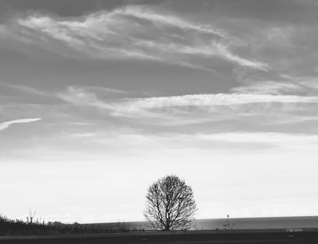
I love that magical tree at the end, Teresa, wonderful composition 🙂
Thanks so much Sofia.
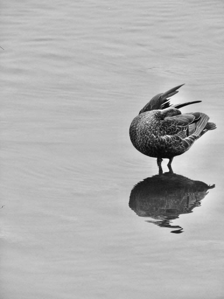
The composition is the key in these images, the duck with the reflection, the first one is also lovely. I love the tree, but I would have composed it a bit more in the lines of three thirds, I hope you don’t mind me saying that, because I think it is a great shot. I also like that you have the one in sepia tones.
I don’t mind that comment especially coming from you. You are one of those people whose photos I admire. Thanks so much Ritva.
Thanks 😍 and happy to hear.
You’ve captured the spirit of minimalism here Teresa, in your words and choice of subject. I like the lone duck and the tree, though I agree with Ritva that the latter would look even more striking if cropped to place it off centre as per the rule of thirds. And maybe a vertical crop???
Thanks Sarah. Yours and Ritva’s comment got me thinking. I tried the vertical too but I don’t know I much prefer the horizontal. What do you think?
I definitely prefer this crop. Because the image has so much negative space there are probably several ways you could crop it and each would give a different effect so it becomes very subjective!
Well chosen for the week Teresa – especially loved the bull silhouette
Thanks Tina. I also love the bull. It was taken while the bus is in motion so I am quite happy with myself.
Marvelous images. My favorite is the bull.
My post for this challenge: https://cafeludwig.com/2026/01/minimalism/
Thanks Ludwig for liking the bull… Stand high and prominent on the landscape.
Wonderful gallery! The bird with it’s reflection is my favorite.
Thanks so much. Glad to know your favourite.
I know that bull!
Oh yes! 👍🏽
The tree at the end and the light on the wall are my favorites, Teresa. Wasn’t this a fun challenge?
Yes it is, Janet. Thanks to Ritva.
Lovely gallery, Teresa – I fell for the bull…!
Thanks a lot A-C. ❤️