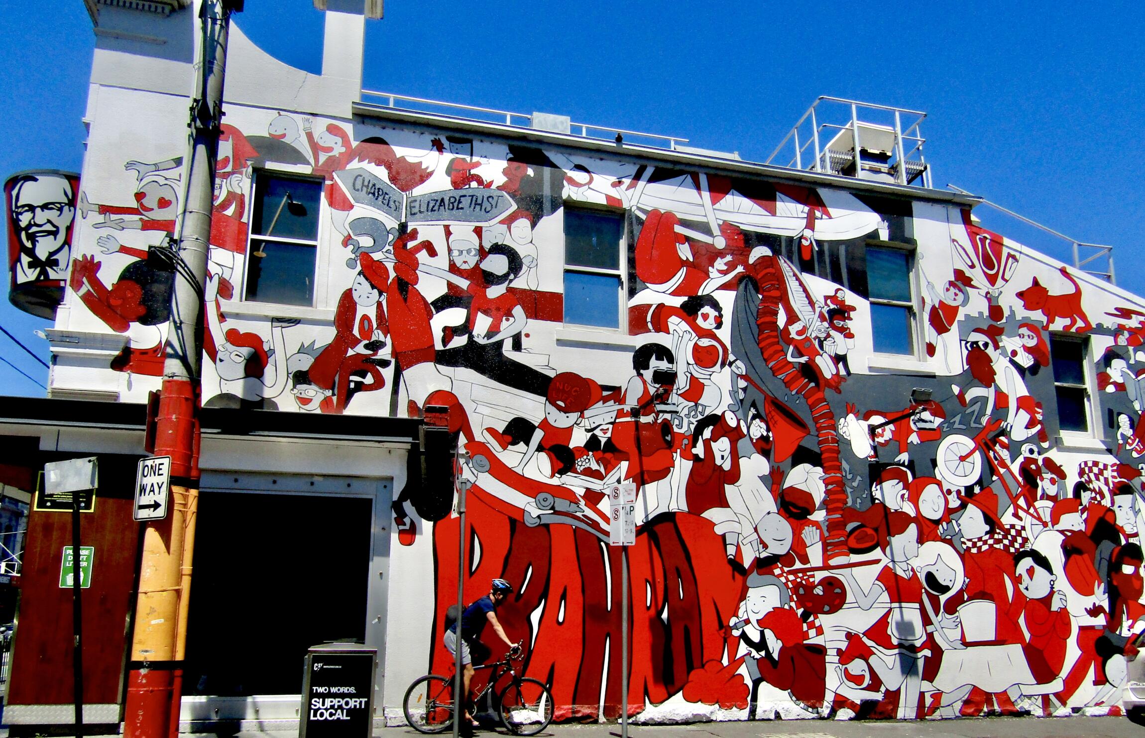
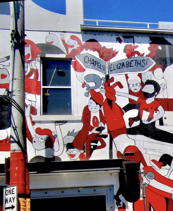
The mural is created around the windows and it covers the height and width of the building. It is painted with red, as you can guess, to go with the KFC logo. And if you will notice… the people on the upper left side are all reaching for the bucket, which is really a great and inexpensive way to advertise.


Wow! There is a lot in that mural! Very cool!
Yes I know Lisa. If you stare at it long enough you will discover a lot.
Incredible… Very red and so cool!
Haha yes so much action!
You can’t miss this one! Love it!
Thanks for liking it, Aletta!
You’re welcome
That’s a fabulous Monday morning wake-up!
Amazing shot!
Thanks Meikah!
Wow! That is one graffitied wall!
🙏🏻
A great advert for KFC for sure. Never seen a mainly red mural, but it’s certainly ey-catching.
Thanks for participating in Monday Murals.
Thanks Sami. It is an interesting wall.
Fine way to treat windows! Fine photos! Thank you!
My pleasure Ludwig!
Not sure why but it reminds me of Sgt. Pepper’s. 🙂 🙂 The colour is great!
Uhmmm now that you said it. I could also picture it in my mind.
I was amazed what a muralist can do with a limited color palette. Beautiful. Great ad for KFC, too.
I know right?!
This is such a cool and fun mural. 🙂
Great find, Teresa.
Thanks so much for stopping by.
Such a vibrant mural – so clever how it incorporates its surroundings, and with advertising to boot!
Yeah that is true! Good thinking indeed!